(Fonts taken from www.dafont.com)
Showing posts with label Research and Planning. Show all posts
Showing posts with label Research and Planning. Show all posts
Thursday, 20 March 2014

Wednesday, 19 March 2014
Tuesday, 18 March 2014
Wednesday, 5 March 2014
Monday, 3 March 2014
Pulse (Music Magazine) Contents Page (Draft)
This is the first draft of my Contents page. I am happy with the way it came together, as it conveys the tone and intentions of the magazine quickly and easily through the use of colour, though it does look a bit spacious. Feedback from peers has told me that they believe the panel of names to the right looks very small and spacious for an area so large, so I've decided that I will replace this with some images; the images I use will feature small numbers, indicating the page that the picture is related to, so as to aid in navigation and make the magazine pages and stories feel more connected and in tune. I'll also be fixing a small issue where the bleed margin has not cut off the edges of the image, leaving the chain in the corner to be cut short; it only just reaches the bleed margin due to the photograph I took, and I didn't want it to be too large on the page, nor did I expect the bleed margin to appear. I have also decided that I should give credit to the photographer if I am to remove the panel, and so will attack some small text to the image doing so. I am going to keep the border of chains (multiples of my chain photograph) as it helps with the general tone of the magazine and helps establish the genre further. I am pleased with the way that I was able to construct the page, and believe that the elements of the page, however small, have all proven necessary and conveyed the intended tone.

Thursday, 2 January 2014
Photograph process
Below is some of the thought process, trial and experimentation, as well as a selection of some of the most successful photos taken of my model for Pulse Magazine's contents page, Cover Page and Double Page Spread. Not all of the photos will be used, furthermore none of the photos present have undergone any form of editing.
Pulse Magazine Articles
'Pulse' magazine articles
Features
This section deals with the featured articles.
John Davies back again
Jack Black Black Jack
'Black Veil Brides' unveil their secrets
Grohvling to Grohl
Ho Ho Hope for humanity
Tours and T's for all
Rising through the ranks
Everyone's favourite Frisbeee goes from a staggering fall to a standing ovation.
Everyone's favourite Frisbeee goes from a staggering fall to a standing ovation.
Props for the props (fashion advice from a celeb)
Metal goes on, but does 'moshing' follow?
Rockbottom to Rockstar (guide for music)
There will be Blood on the Dance floor
Metal made in Japan
New year's resolutions
Regulars
This section deals with the regular articles.
Fan-works (fan artwork)
Dearest Fans (fan letters and conversations)
Freebies, you say?
Our Artist of the Month
Studio Crash (invading other bands' studios)
Choice Cuts (clips)
Gigs and Giggles
Employee of the month!
Guppy Guitars
Wednesday, 1 January 2014
Pulse Magazine Flatplans
Below are the flatplans for the pages to be featured in my music magazine completed through Adobe InDesign, embedded through Scribd.
Interview for Pulse magazine main article
Intro
This will just be a short greeting and a little small talk to break into the interview. Few fan questions or rumours may be used to begin the topic.
Interview
These questions will be the solid points to cover, as well as places of refuge for when the conversation begins to stray from the topic.
1. What exactly happened?
2. How and where did this happen?
3. So, what exactly are you doing at the moment?
4. I've been told that you hated the sight of your guitar for a short time.
5. Here at Pulse, we know that the fans are buzzing! How excited are you?
6. Could you give us a little taste of what you'll be pulling out on the 20th?
7. What do you have planned for the future?
(8.) Well, us lot at Pulse wish you the best of luck and hope it all goes well this time round! Thanks, Frisbeee.
(These questions are guidelines as to how I will carry out the interview. The interview covers every aspect of the story, as well as finishing on a high note and getting the info that the audience would likely want to see, such as upcoming gigs and dates of importance. Obviously, the questions or decisions I make can and will likely change due to what the responses are, but these are the solid outlines and points for the interview).
Thursday, 5 December 2013
'Pulse' title concepts - Adobe Flash Professional CS6
First, I set up 2 masking layers using the new layer button, and right clicked the layers to transform them into masking layers. I then placed one under the other to bind them together, and create the ability to have a 'revealing' layer and a 'background' layer.

After this, I created my title using the line tool and fill tool, as well as as double clicking the outline afterwards to select it all for removal, leaving behind an unoutlined title. After ensuring the title was 'broken apart' and not in a group or converted to a symbol, I locked the layer (Green was chosen due to it's visibility, plus colour won't matter as the shape and fill are the only important objects here).

I then imported an image as the backdrop for the text on the layer below the text's layer. After positioning, the only thing left to do was lock both layers, allowing for the top layer to reveal the bottom layer's contents where there was colour.

I then experimented with this technique with many different patterns and backgrounds, each possessing some link to the genre and tone I aim to create. This can also be done with brush strokes, as demonstrated on the right of the below image. I believe this to be an easy and straight forward way to create detailed text with ease, and may carry one of the designs on to my magazine.

(The backgrounds used here were downloaded from www.Google.com, with the exception of the centre-left texture, which I made quickly using Photoshop, and have only been used for planning and testing purposes and will not be used or incorporated into my work).
The images below, however, were taken and created by myself, though I believe that only the top few (so far) are appropriate for use.

Tuesday, 3 December 2013
Monday, 2 December 2013
Press release
Pulse Magazine
Norwich, Norfolk – 2nd December 2013. Bauer Media
Group publishing will be officially launching Pulse magazine in print and
online in March 2014. Pulse magazine aims to bring the latest and greatest info on your favourite tracks, bands, upcoming gigs and interviews with our favourite selection of artists. Those with a taste for the heavier area of music will appreciate the wide spectrum of mixed genres and artists featured. Pulse will focus on the latest news of your favourite mainstream artists, but will also pay attention to newer members of the musical community rising through the ranks and bringing a breathe of fresh air to their genre!
Pulse aims to appeal to people age 16-25 who can appreciate genres ranging from heavy dubstep, electronic, rock and metal. Pulse will also feature a very fan-interactive section dedicated to reviews and fan letters, as well as freebies, special offers and events throughout it's lifespan!
Appealing to the niche market and filling a void in the market, the new and unique magazine hopes to mix genres of similar types to appeal to a wider audience opposed to just including mainstream genres and artists, allowing for so much more distinction among it's competitors.
Pulse will be published monthly and digital copies will be available on desktop computers, as well as tablets, androids, windows phones and various smartphones, including iPhone. The price is just £4.99, which will be indifferent for hard and digital copies. Pulse will be available for subscription at just 99p extra - bringing along a bountiful reward of offers and freebies.
Sunday, 1 December 2013
Tuesday, 19 November 2013
Audience Profile
Below is my audience profile, representing the average person from the results gathered from my questionnaire.
Thursday, 14 November 2013
Music Magazine Questionnaire
Here is my Questionnaire. The powerpoint presentation I have made has helped analyse the overall votes for each answer featured on each question. This will allow me to construct a magazine to suit the targeted audience and general features necessary to please a wide audience. For example, I now know that my audience is mainly 16 years old, and that the audience would be quite happy paying for a magazine featuring the content I will include for the price of £4.99. The results gathered have allowed for enough information to construct the articles and attractive features to appeal to a wide audience, plus I have conducted analyses into other magazines of similar genre to my desired Music genre, and so I know the general design and features that could be included, as they have proven to be a valuable asset to the other magazine. The questions chosen will allow for the conclusion of a specific person, and allow for the creation of an audience profile to build the magazine around.
Tuesday, 12 November 2013
Primary Research - Magazine Analysis - Terrorizer
Terrorizer Magazine Analysis.
I have created the analyses for 'TERRORIZER' through the use of Prezi, and have listed them below:
Front Cover Analysis
Contents Page Analysis
Double Page Spread Analysis
Thursday, 7 November 2013
Who decides how musicians/bands are represented in music magazines?
Some bands are chosen to be represented in a particular way
to influence the interest of, and to inject loyalty into their many fans. For
example, one direction is never shown with members of the opposite sex so as to
keep the fanbase involved and attracted to the band members as well as their
music. Some bands will be chosen to be represented for different reasons, or
just for different types of fans, such as KoRn, who are represented as very
expressive, loud and free to appeal to their fans. Different music types will
need different appearances in the form of company, camera angles, poses and
immediate appearance. Heavy Metal bands will choose to wear dark, rugged
clothing; have black, long or messy hair; tattoos in plain sight; and generally
come across as loud and disruptive. The representation of Metal bands in this
way, such as ‘Five finger death punch’ and their iconic images associated with
death and violence are chosen by the audience, themselves, their producers and
the photographers. Musicians such as Justin Bieber would possess very contrasting
actions and languages, and would wear clothes that fit the popular fashion
amongst his target audience, of which brings in opportunity to advertise and
flaunt newer trends for more money, as the fans would likely follow to some
extent. However, the artists themselves can and evidently do have a lot of
control over their appearance, as shown by Miley Cyrus and Justin Bieber with
their sudden transition of image, though this could easily be down to the manager
wanting more interest/profit. The manager of the band would have a lot of
control over how the band is represented, as they are in charge of the
management of the band’s performances; artists will need to play with
supporting acts of a similar genre, and they are careful to ensure that the
other artists are not too contrasting in representation. Photographers may also
decide upon the way of which a band or artist is represented in a music
magazine, as they have so many options and routes of which can lead to very
different messages conveyed; someone showing a screaming or punching pose will
instantly convey feelings of anger and a generally expressive and free tone,
for example. Furthermore, the manager may decide that the artist or band is not
receiving enough attention or money, and so would decide to change or alter the
representation. Lastly, the audience may dictate the representation as they
change and grow older; a band may have the same fans for many years, and the
fans may see or want something new, and so the representation must be adapted
to fit their newer needs (having the same style/image/band personality for long
periods of time can become boring in some situations).
Monday, 21 October 2013
Primary Research - Magazine Analysis - Metal Hammer Double Page Spread
Double Page Spread
Content
Initially, we are shown that same housestyle and colour palette as beforehand in the magazine, including the red accent colour amongst the black and grey in order to show importance and focus on the coloured areas. The title is shown with this effect, and so instantly draws in the reader's attention to the page's title, thus purpose. Metal Hammer's first double page spread features messages and letters sent in from the metal community in order to present a particular opinion or get others involved, as well as acting as a form of FAQ. The magazine (and metal community in general) enjoys and feeds from people getting involved, and shows us that they enjoy community events and discussions and respects their fans, as well as their opinions. The metal community lives from dedicated and loyal fans, and this magazine is a channel for people of this sort, and so it is a completely appropriate first double page spread for the genre and theme.
Layout and ease of use
The red, black and generally dark colours are carried across in the same fashion as before on the contents page to retain the house style of the magazine and keep the audience engaged. Is also promotes a sense of ease with viewing the magazine; readers get accustomed to the layout and features of the magazine and learn to locate objects of interest with the colours and layout given. The double page spread features ten (five for each page) columns in total. This is more than the previous three columns per page layout for the contents page, however this is more appropriate for the content of the page, which consists mainly of fan letters and general metal community news and short stories to ease into the magazine. The shortness means that to have more columns would allow text to be 'taller', and makes it look more filling. Though the page features columns, they do not line the whole page as the title takes up a large black space as a form of intro to the double page spread, as well as the feature of the page of which is a chosen fan letter. The first of the pages also features a strip of text at the very top acting as a form of summary of the page, as well as the title, followed by social network details; including all of this crucial info allows the user to have all the information about the page's intentions before beginning.

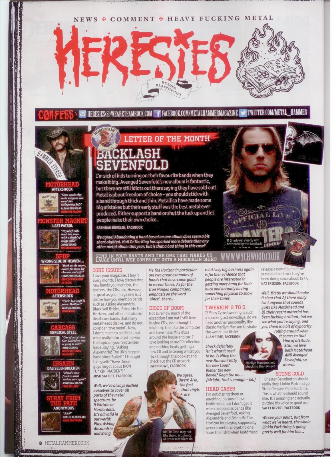
Colour
The colours used are basically the same as used previously, consisting of the red accent colour to help with navigation and selection of important objects of interest or information, as well as the black 'containers' for important pieces of text. The background is also white, which makes it easier to read the small black text. The colour of the text does however change when inside the black boxes along the left of the left page and the right of the right-hand page to a pure white for clarity.
Images
The images used are seen as of great importance and relevance to the stories and genre, and so when text collides with it, it will just move around the images. The images also seem to refuse the boundaries of the columns, but this allows for a form of 'organised chaos' on the page; metal is associated with screaming, expression and mess, so though the pages have to be organised, they can defy this rule in small sections.
Thursday, 17 October 2013
Primary Research - Magazine Analysis - Metal Hammer Contents
Contents page
Layout, text and images.
The contents pages feature the standard 3 column layout, with a good balance of pictures and text, donating only 1/6 to the double page spread to Editorials, Artists, marketing, and generally the people involved in the creation. The font for the headings is quite large, with the colour being black to contrast with the white background for good visibility, of which is necessary to attract and convey a message as quickly and succinctly as possible to the reader. The font is also slightly 'abrasive', and looks quite rough to keep the metal tone and mood. The main heading "Times change, metal never does" is an audience specific title concerning metal fans, of which would show the magazine's appreciation and their feelings of loyalty with their fans. This choice of title is excellent for the magazine's general feel; it allows for fans to feel inclusive and respected, as well as showing off the genre's long lasting unity. The colour and thickness of the font is also interesting, as the front cover differs so greatly in style and layout; it features just the band in a black and white scene with little text, though the card cover is meant to convey the whole feel due to it being a special edition. The main title within the contents page is thin, spacious and black to show up and be able to read well, which is very different to the columns of text, further making it stand out. Images are placed in line with columns, and hold a good text-to-picture balance, as well as being labelled with the red accent colour used with the magazine. This allows for ease of use, and lets the reader flick to the pictures that interest them, and will also be unlikely to be randomly chosen and could be very popular with the magazine users, or the magazine may have deemed them as particularly interesting or long sections. We are also shown advertisements and offers at the bottom relating directly to the magazine for an increase in publicity via sharing and presenting the news across platforms to cope and keep up with the ever-growing use of technology. The featured band in this edition is also a key element of the contents page, and so the cover is shown again within the story. The images feature facial expressions, and so are close-up stills with the lighting, gestures and scenes differing between musicians shown, as each has a well known staple look. They are also artists of high status to which people aspire to be like or look up to, with names such as MotorHead being mentioned, and artists from different bands having photos together. Every image is related, or shown, with a page in the magazine, and so holds a lot of meaning and is very interesting or important to be shown on the contents page opposed the dozens of others that were not.
Colour
Throughout the contents pages, we are shown an outstanding accent amongst the whites and greys of the background. This accent is so bright and outstanding by contrast that it can highlight the smallest of areas, such as the page numbers. This lets the reader find objects of interest, while helping to brighten up the page, providing function and attractiveness. The colour itself is also quite eye catching, which is why this was chosen opposed to colours what wouldn't fulfil the needs, such as silver or purple.


The background and general colours mentioned while looking at the page consists entirely (apart from some of the images) of black and white. This theme lets text be clear and smart, and is easy to read in the sense that they contrast better than other colours might; a red background with blue text would contrast, but it would be awfully hard to read and generally unpleasant to look at. Apart from page numbers and references, we are also shown red accented advertisements, such as the offers with subscription and details with the 'IPad edition'.
The general theme of the black and red colours enhances the mood of the Metal genre, creating moods of badness, rage, depression, anger and strong expression.
Subscribe to:
Posts (Atom)