Double Page Spread
Content
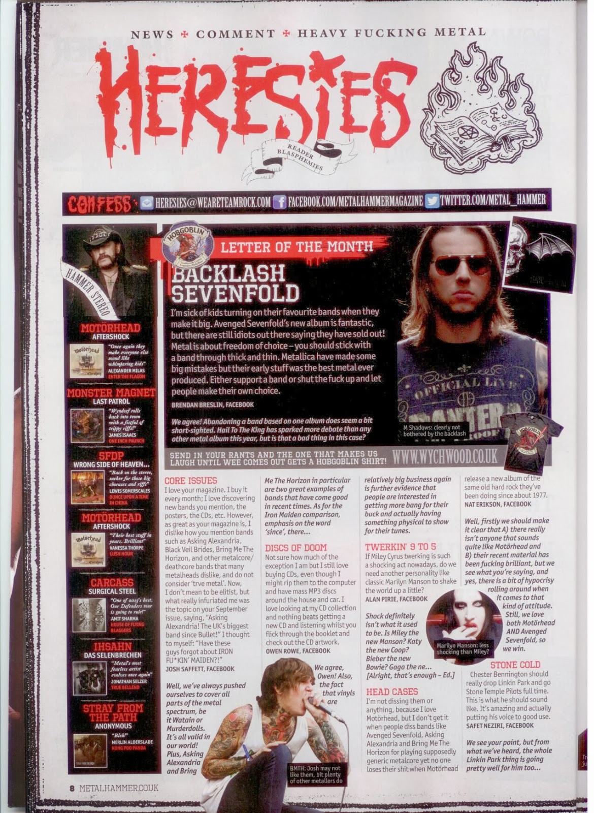
Initially, we are shown that same housestyle and colour palette as beforehand in the magazine, including the red accent colour amongst the black and grey in order to show importance and focus on the coloured areas. The title is shown with this effect, and so instantly draws in the reader's attention to the page's title, thus purpose. Metal Hammer's first double page spread features messages and letters sent in from the metal community in order to present a particular opinion or get others involved, as well as acting as a form of FAQ. The magazine (and metal community in general) enjoys and feeds from people getting involved, and shows us that they enjoy community events and discussions and respects their fans, as well as their opinions. The metal community lives from dedicated and loyal fans, and this magazine is a channel for people of this sort, and so it is a completely appropriate first double page spread for the genre and theme.
Layout and ease of use
The red, black and generally dark colours are carried across in the same fashion as before on the contents page to retain the house style of the magazine and keep the audience engaged. Is also promotes a sense of ease with viewing the magazine; readers get accustomed to the layout and features of the magazine and learn to locate objects of interest with the colours and layout given. The double page spread features ten (five for each page) columns in total. This is more than the previous three columns per page layout for the contents page, however this is more appropriate for the content of the page, which consists mainly of fan letters and general metal community news and short stories to ease into the magazine. The shortness means that to have more columns would allow text to be 'taller', and makes it look more filling. Though the page features columns, they do not line the whole page as the title takes up a large black space as a form of intro to the double page spread, as well as the feature of the page of which is a chosen fan letter. The first of the pages also features a strip of text at the very top acting as a form of summary of the page, as well as the title, followed by social network details; including all of this crucial info allows the user to have all the information about the page's intentions before beginning.
.jpeg)
Colour
The colours used are basically the same as used previously, consisting of the red accent colour to help with navigation and selection of important objects of interest or information, as well as the black 'containers' for important pieces of text. The background is also white, which makes it easier to read the small black text. The colour of the text does however change when inside the black boxes along the left of the left page and the right of the right-hand page to a pure white for clarity.
Images
The images used are seen as of great importance and relevance to the stories and genre, and so when text collides with it, it will just move around the images. The images also seem to refuse the boundaries of the columns, but this allows for a form of 'organised chaos' on the page; metal is associated with screaming, expression and mess, so though the pages have to be organised, they can defy this rule in small sections.
No comments:
Post a Comment