Monday, 17 March 2014

Focus Group feedback

Pulse Magazine Cover, DPS and Contents Page feedback


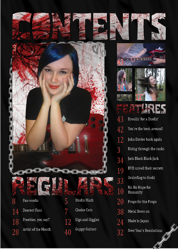
The feedback I received from the focus group was mainly aimed at the contents page, as the cover page, they felt, carried across the house style well, featured relevant titles, quotes and coverlines, and had no issues with visibility of text or information. The only criticism was the colour of the coverlines, which they suggested could be trialed with blue to match the model's hair, or the murky golden texture on my text could be removed. They liked the use of colour, as well as the small features contributing to the tone of the magazine, such as the texture within the title, and the red guitar my model is holding.


The Contents page was looking a little spacious in places, and didn't feature the social media buttons necessary for my target audience. Furthermore, I have the space to include more coverlines, or, as suggested, create some quotes or information below each coverline for extra interest. I agree with these ideas, as the contents page does look bare and spacious, and I plan to incorporate these into it. I was also told again that I could include the hair colour of the model within the text to carry across some association between them, though I'm not sure of this yet, as it could lead to too many colours being used and disruption of the house style I hope to maintain. The group liked the border of chains I crafted, as well as the chain shown in the corner, as it adds to the theme, as well as the patterns and textures used in both the text, image around the model, and the actual black and grey background behind it all.


The group also thought that the double page spread was a little too conventional, as they noticed that I had challenged a few stereotypes but left it completely stereotypical on this page, and hadn't placed many story related features and elements to the DPS. I was also told, to which I agree, that my double page spread's main image (my model) was unfitting to the magazine, being ill-lighted, unclear and generally unfitting to the first page of the DPS. They did however like the use of the chains as borders, something that I have previously incorporated (thus making it an element of the house style), as well as the space for related articles or elements of the story.
  

Friday, 14 March 2014

(First Draft) Pulse magazine double page spread


Feedback from my peers revealed that with the first page, the main image I used was not professional enough, and didn't feature the clarity that should be used with such a large and focal image. I was displeased with the image myself, as it had not had much editing and so had a few flaws, but it was difficult to edit with the lighting used. Due to these reasons, I have decided that I will find a more suitable image from the selection I gathered with the photoshoots I did.

The title will obviously stay the same, as I, as well as those who gave feedback, have agreed that the titles used are fine for the genre and theme intended. The chains will also be kept, as they help maintain the house style and do not disrupt the page much at all.

I think that I will add a splash of colour to this page, as well as a large quote of some sort, as I have found this to be conventional to the genre. I will also change the background colour to black, and raise the brightness of the box containing the standfirst so as to give the page clarity and visibility in all aspects. I have not deviated from my flat plans very much.

For the second page, I stayed with my flatplan quite well, maintaining the formality of columns while including themes of the metal genre. However, feedback pointed out that I could include some kind of border for the text, as it looks jumbled in the places with quotes, and has no division apart from a small white space between the columns. It would also be very difficult to fit my interview into the space allowed if I were to include areas for other stories, however I do like the idea of a banner across the top containing key information, though I will relate it completely to the story of the pages here opposed to other stories. I will also include another image somewhere on the page, as my feeback has told me that too much text is sometimes bad to have in a magazine, as the audience wants to see pictures related to the story opposed to a solid body of text; people of the target audience, as shown in other metal orientated magazines, like lots of different images related to the story or article they're featured near, which is why I will also do something to the quotes to bolden or stand them out; the page feels a little dull in colour at the moment.

(The text used is foreign, as it is temporary filler, of which will be replaced with the story and interview at a later stage).

Friday, 7 March 2014

Pulse Contents Page (Final Draft)


This is my contents page after making a few alterations based on feedback


The only changes I made to the contents page was the substitution of the panel of names for images related to articles, as my feedback indicated that the page looked to spacious with the text, plus there was not enough room for it, realistically. I also believe that I may substitute some of the new images for social network buttons, as my target audience is thoroughly familiar with and utilize social networks often; crossing platforms adds to ease of access and a wider audience. I will be increasing the visibility of the text on this page in a later stage, this is just a draft for analysis and a general view of the content and it's arrangement.

Monday, 3 March 2014

Pulse (Music Magazine) Contents Page (Draft)

This is the first draft of my Contents page. I am happy with the way it came together, as it conveys the tone and intentions of the magazine quickly and easily through the use of colour, though it does look a bit spacious. Feedback from peers has told me that they believe the panel of names to the right looks very small and spacious for an area so large, so I've decided that I will replace this with some images; the images I use will feature small numbers, indicating the page that the picture is related to, so as to aid in navigation and make the magazine pages and stories feel more connected and in tune. I'll also be fixing a small issue where the bleed margin has not cut off the edges of the image, leaving the chain in the corner to be cut short; it only just reaches the bleed margin due to the photograph I took, and I didn't want it to be too large on the page, nor did I expect the bleed margin to appear. I have also decided that I should give credit to the photographer if I am to remove the panel, and so will attack some small text to the image doing so. I am going to keep the border of chains (multiples of my chain photograph) as it helps with the general tone of the magazine and helps establish the genre further. I am pleased with the way that I was able to construct the page, and believe that the elements of the page, however small, have all proven necessary and conveyed the intended tone.

Wednesday, 5 February 2014

Background Ideas

These backgrounds were made with the help of a program called 'Hexels', whereby individual pixels, or trixels in this case (3 sided shapes, basically triangles), can be coloured individually and applied with a glow, such as the rainbow hex glow I applied for this image. As well as the preset pixels and trixels, custom shapes can be made and applied upon flattening the image created onto a background layer and dragging vectors into position to create a shape, followed by the ability to draw with this new shape. I used this to create the rain effect.


The one below was a more creative attempt, utilizing cube shapes, as well as a range of colours, which could be used incase the calmer image above is not as appropriate for the theme of the page or area chosen, though it would be considerably harder to apply text due to the many colours and shapes involved.

 
The pictures to the left and right are both more experimental ideas, combining Hexels and photoshop. The mountain, clouds and glow were all created through Hexels, though the tree and bird were added on a new layer, but were drawn free-hand in the polygon style already shown throughout the style of work I have been creating. The 'Rainbow Pillars' I made to the left were created in Hexels, and the glow was also added inside the software, however I used Photoshop to apply a filter, brightening the colours shown and increasing the glow. I also managed to use Photoshop's eraser tool to clear any random spots or anomalies drifting around in the black space.

These images were experimental, and the program did have potential, however I am unsure if i will incorporate them into my magazine; some where used in the college magazine, but my music magazine has no need for images such as these. However the program does make nice backgrounds, and will be considered greatly for this purpose.