Looking back at your preliminary task, what do you feel you have learnt in the progression from it to the full product?
(I apologise for my slight stutter, as well as my cold)
Sunday, 30 March 2014
Saturday, 29 March 2014
Evaluation Question 6
What have you learnt about technologies from the process of constructing this product?
In the process of making my music magazine, I used a number of online tools to upload and arrange and convert the posts featured on my blog:
- Scribd
- Prezi
- Youtube
- Slideshare
- (Blogger)
Scribd, I learned, can be used to upload word and PowerPoint documents to blogger while retaining the font, shape, margins and positions of various elements on the document in the form of a large scrollable box. This allows for easy presentation of a document as it is, and was used numerous times on my blog, such as my photo shoot and it's analysis; I am able to view my blog and scroll through the various photographs and descriptions with the images used in the correct places.
Prezi is an online program that functions in a similar style to powerpoint, as it allows for the presentation of images and text on a chosen path. However, Prezi allows for further exploration of this method of presentation, being more aesthetically pleasing, allowing for increased manipulation, navigation, and allows for more presentation styles including spider diagrams, flowcharts and mindmaps. I used this for evaluation question 1, as well as my magazine research task.
Pinterest has enabled me to 'pin' images to an online board, so as to accumulate a collection of images which bare connotations to the genre, allowing for a 'moodboard' to be developed. This allowed me to gather images that could be analysed (which they were) and let me generate a larger idea of what kinds of images my magazine could incorporate to construct a housestyle.
Youtube enabled me to upload videos and embed them onto blogger using a link generated with the video. I was also able to use this embedding process with Scribd and Prezi; this allows for the content to be viewed on Blogger without any form of navigation to other pages.
These programs helped with the process of constructing my product, as I was able to place content directly onto my blog posts, in most cases, opposed to leaving links, allowing for easier navigation of my blog and an easier time viewing,displaying and arranging my research ready for the process of construction and general reference.
I also developed my skills with the following programs for the process of construction:
- PhotoShop
- InDesign
- Macromedia Flash
With Flash, I was able to use a process I practiced in the past known as 'masking', which allowed for an easy path to applying texture to a selection shapes and letters, as well as moving the texture around to perfect the positioning of it inside of the text or shape. I used this process to construct my titles, and preferred this over the process of filling the text I created with the texture, as the masking method was much easier to alter and position. I also learnt that files which I wished to import into InDesign must be exported as PNG files, as the transparency around the images exported would not apply with other files types, such as JPEG.
InDesign helped with the construction of my product with it's easy process of setting up columns and pages. Magazines, of which usually use columns, 'bleeds', margins and general organisation can be created with such ease using this program. This program also allowed for easy construction of images that curved text around them, and made the task of wrapping text around shapes easier. It also allowed for me to see the double page spread pages side-by-side as I worked, allowing for me to transfer text and images across to retain the house style I established with the cover and contents pages.
PhotoShop allowed for large and small editing of various images. I used it to not only quickly draw layered backgrounds and images (such as the small black backgrounds used with the columns on the DPS) but to apply transformations and effects to photographs for the magazine. For example, the picture of the chain that I took and quickly edited using a hue/saturation layer. I made thorough use of the selection tool, with it's magnetic selection feature that automatically draws along the outline of shapes for quick object selection. This can be used to separate the part of the image needed from the background or white space. There was also a process I used whereby I was able erase the background in another way, which is where I selected the part I wanted to keep by selecting around it's outline with the polygon select tool, and then inverting the selection with the 'select' option at the top of the screen with the other tools, and going over the whole image with the background eraser to delete the background, lastly, cleaning up the edges of the image by reducing the hardness of the eraser and going around the edge; there are so many different ways to edit an image to be exactly the way you want it, and PhotoShop proved to be my most valuable asset for these reasons.
Thursday, 27 March 2014
Wednesday, 26 March 2014
Evaluation Question 3
What kind of media institution might distribute your media product and why?
TeamRock might distribute my media product, as they already publish magazines of the rock/metal genre, of which I researched. Metal Hammer, a magazine that influenced my choices greatly, is published under this company, and so bears a similar style to mine, and would likely benefit from their publication.
Bauer media group is also a good company to publish my magazine, as they also publish not only hundreds of different and varying in genre magazines, but they also publish Kerrang!, one of the most mainstream metal magazines. This would mean that my magazine could benefit from their publication greatly, as they have managed to keep Kerrang! in the top area of it's genre.
I would also consider dark arts limited, as they publish Terrorizer, a magazine that I took a look of information from, and has greatly affected many of my choices. They, like Bauer, distribute a magazine which is considered in the lead of it's market, and so would prove, and has done so, to be an amazing distributor for my magazine, as both are of similar theme and genre.
Tuesday, 25 March 2014
Monday, 24 March 2014
Evaluation question 1
In what ways does you media product use develop or challenge forms and conventions of real media products?
Sunday, 23 March 2014
Pulse Front Cover Final
This is my Cover after a few tweaks suggested in my feedback

I decided that I would leave the majority of the page alone, as it seemed to use forms and convention of existing magazines well enough to be recognised and appreciated for it's genre. However I did decide to take the advice from my feedback and change the colour of the 'Rise Up!' text to match that of the model's hair, bearing some association between the two and ensuring good visibility against the contrasting black background. For this I used the method involving selection and placement of a hue/saturation layer, enabling me to increase the brightness slightly, as well as saturation and colour. I also used this process to change the text above the barcode to red colours to keep with the house style of the magazine, with the 'FIRST ISSUE' text being blue to link back to the model and her significance.
I also changed the brightness of the coverlines slightly to allow for increased visibility; some people commented on how this text was hard to read. I thought about stretching the text across and giving it some width, however I liked the style of it, having seen it used on magazines such as 'Terrorizer'.
I also decided against the idea of changing the model's hair too much, as I felt that there was enough activity on the page for her hair and body to need any adjustment; simplicity is something that I feel could be featured more on my magazine, although the activity on the pages in necessary.
(Final) Pulse Contents page

(The only alterations are the social network icons, of which I decided to add due to my target audience's thorough use of social networks and online platforms.

Thursday, 20 March 2014
Wednesday, 19 March 2014
Double Page Spread (Final) Analysis and thought process
I decided that I would change the main image, as it felt quite unprofessional, unclear, ill-lighted and didn't fit the page in my opinion. Peer feedback also confirmed this, as they felt it was too large and detailed in the background to retain some professionalism, however this image featured a fairly blank background, clear face and hands, much sharper and was generally nicer to look at. You can also see the model's hair with more clarity, which is a theme I have made constant throughout. I took this image from my first photoshoot. I have also drawn, with a paint brush styled brush tool, a few little splashes of colour fitting into the genre's idea of messiness and vandalism, while also linking back to the artist and her subtle persona as cheeky and mischievous. In addition, I placed a slightly tattered quote to fit with the article, which I have been told with feedback looks nice and fits with the page. Although the colour clashes slightly with the red, the reasoning behind it (the model's hair and her association with the colour blue) compensates for this. I also added page numbers to the pages, as well as a black background I have used previously.
The second page featured the standard 3 column setup, which was used but not evident with the first page of the double page spread. I decided that I would fill the top of the page with upcoming gig dates, as this was something my target audience liked to see in a magazine, and decided to attach chains from it to the columns below for a link between the objects to establish some kind of mess amongst the order and alignment for the feel of a metal magazine. The quotes I made red to include some of the colour from the small range I have used so far and maintain the house style, as well as lightening the speech marks against the black borders I created for visibility. I also decided that the questions needed to be a different colour to stand out amongst the body of text, and blue was the choice I made as it links back to the artist and was easy to read. I also added a few more chains to help carry on the theme, and placed an image of the artist in the bottom right-hand corner. The image featured her guitar and seemed appropriate.Feedback has confirmed a few of my choices, such as the column changes, chains, colour choices and gig dates section at the top, however they disagreed with my font choice, however it could not stay the same as what I had previously used as it was far too hard to read; the new font used for the interview and standfirst stood out well and was wide enough to read with clarity. I also decided that I would type her speech almost exactly as it was said, using words and phrases such as "s'fine", as I felt that this brought truth to her words, and allowed for an informal approach that could form a link with the reader. As a final tweak, I weakened the drop shadow of some of the text, and increased the brightness of the white boxes of each of the pages (I have also added a last minute chain along the joining line between the pages, as the difference in colour didn't look right without any form of separation or transition, according to my audience. This chain may not be shown on my evaluation as I am analyzing the pages separately, and so the pages may look odd when split in half).
Tuesday, 18 March 2014
Monday, 17 March 2014
Focus Group feedback
Pulse Magazine Cover, DPS and Contents Page feedback
 The feedback I received from the focus group was mainly aimed at the contents page, as the cover page, they felt, carried across the house style well, featured relevant titles, quotes and coverlines, and had no issues with visibility of text or information. The only criticism was the colour of the coverlines, which they suggested could be trialed with blue to match the model's hair, or the murky golden texture on my text could be removed. They liked the use of colour, as well as the small features contributing to the tone of the magazine, such as the texture within the title, and the red guitar my model is holding.
The Contents page was looking a little spacious in places, and didn't feature the social media buttons necessary for my target audience. Furthermore, I have the space to include more coverlines, or, as suggested, create some quotes or information below each coverline for extra interest. I agree with these ideas, as the contents page does look bare and spacious, and I plan to incorporate these into it. I was also told again that I could include the hair colour of the model within the text to carry across some association between them, though I'm not sure of this yet, as it could lead to too many colours being used and disruption of the house style I hope to maintain. The group liked the border of chains I crafted, as well as the chain shown in the corner, as it adds to the theme, as well as the patterns and textures used in both the text, image around the model, and the actual black and grey background behind it all.
The group also thought that the double page spread was a little too conventional, as they noticed that I had challenged a few stereotypes but left it completely stereotypical on this page, and hadn't placed many story related features and elements to the DPS. I was also told, to which I agree, that my double page spread's main image (my model) was unfitting to the magazine, being ill-lighted, unclear and generally unfitting to the first page of the DPS. They did however like the use of the chains as borders, something that I have previously incorporated (thus making it an element of the house style), as well as the space for related articles or elements of the story.
Friday, 14 March 2014
(First Draft) Pulse magazine double page spread


Feedback from my peers revealed that with the first page, the main image I used was not professional enough, and didn't feature the clarity that should be used with such a large and focal image. I was displeased with the image myself, as it had not had much editing and so had a few flaws, but it was difficult to edit with the lighting used. Due to these reasons, I have decided that I will find a more suitable image from the selection I gathered with the photoshoots I did.
The title will obviously stay the same, as I, as well as those who gave feedback, have agreed that the titles used are fine for the genre and theme intended. The chains will also be kept, as they help maintain the house style and do not disrupt the page much at all.
I think that I will add a splash of colour to this page, as well as a large quote of some sort, as I have found this to be conventional to the genre. I will also change the background colour to black, and raise the brightness of the box containing the standfirst so as to give the page clarity and visibility in all aspects. I have not deviated from my flat plans very much.
For the second page, I stayed with my flatplan quite well, maintaining the formality of columns while including themes of the metal genre. However, feedback pointed out that I could include some kind of border for the text, as it looks jumbled in the places with quotes, and has no division apart from a small white space between the columns. It would also be very difficult to fit my interview into the space allowed if I were to include areas for other stories, however I do like the idea of a banner across the top containing key information, though I will relate it completely to the story of the pages here opposed to other stories. I will also include another image somewhere on the page, as my feeback has told me that too much text is sometimes bad to have in a magazine, as the audience wants to see pictures related to the story opposed to a solid body of text; people of the target audience, as shown in other metal orientated magazines, like lots of different images related to the story or article they're featured near, which is why I will also do something to the quotes to bolden or stand them out; the page feels a little dull in colour at the moment.
(The text used is foreign, as it is temporary filler, of which will be replaced with the story and interview at a later stage).
Thursday, 13 March 2014
Friday, 7 March 2014
Pulse Contents Page (Final Draft)
This is my contents page after making a few alterations based on feedback
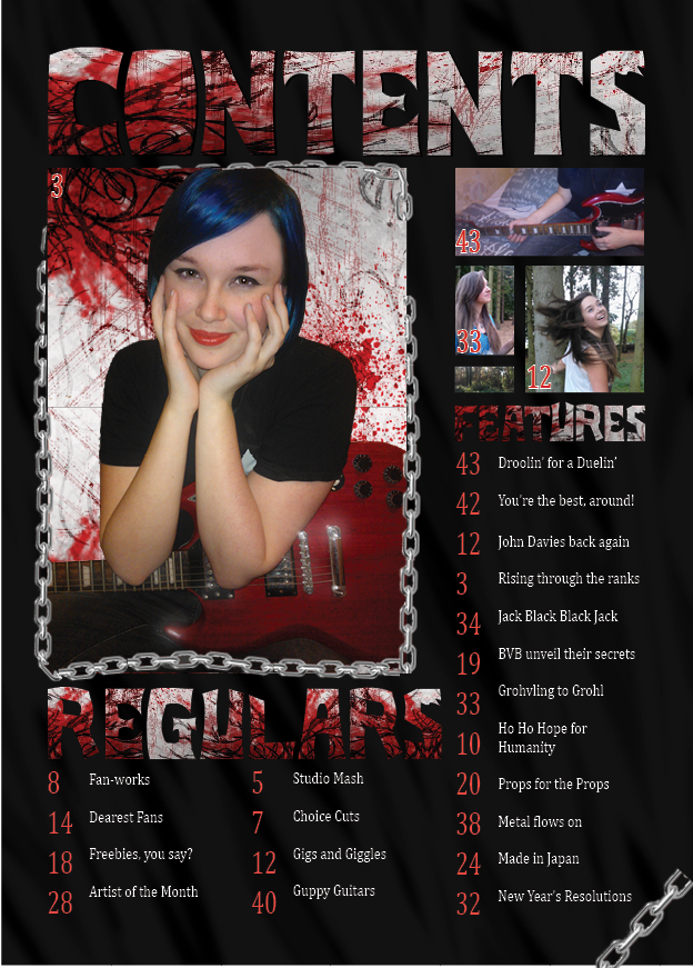
The only changes I made to the contents page was the substitution of the panel of names for images related to articles, as my feedback indicated that the page looked to spacious with the text, plus there was not enough room for it, realistically. I also believe that I may substitute some of the new images for social network buttons, as my target audience is thoroughly familiar with and utilize social networks often; crossing platforms adds to ease of access and a wider audience. I will be increasing the visibility of the text on this page in a later stage, this is just a draft for analysis and a general view of the content and it's arrangement.
Wednesday, 5 March 2014
Monday, 3 March 2014
Pulse (Music Magazine) Contents Page (Draft)
This is the first draft of my Contents page. I am happy with the way it came together, as it conveys the tone and intentions of the magazine quickly and easily through the use of colour, though it does look a bit spacious. Feedback from peers has told me that they believe the panel of names to the right looks very small and spacious for an area so large, so I've decided that I will replace this with some images; the images I use will feature small numbers, indicating the page that the picture is related to, so as to aid in navigation and make the magazine pages and stories feel more connected and in tune. I'll also be fixing a small issue where the bleed margin has not cut off the edges of the image, leaving the chain in the corner to be cut short; it only just reaches the bleed margin due to the photograph I took, and I didn't want it to be too large on the page, nor did I expect the bleed margin to appear. I have also decided that I should give credit to the photographer if I am to remove the panel, and so will attack some small text to the image doing so. I am going to keep the border of chains (multiples of my chain photograph) as it helps with the general tone of the magazine and helps establish the genre further. I am pleased with the way that I was able to construct the page, and believe that the elements of the page, however small, have all proven necessary and conveyed the intended tone.

Subscribe to:
Comments (Atom)