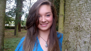
 For my magazine, I decided to use a young woman as the key model, though this may change at a later date depending the genre and content I find most appealing.
 I decided to take the photos in my Nanny's woods, as the lighting could be changed with such ease by literally just turning the camera view according to the perspective of light; Certain areas of the woods were thick with tree and bush alike, making some areas and directions obviously darker. This image was taken in the opposite direction of the sun, so that shadow or darkness did not overwhelm the photo, and instead highlighted darker areas which contrasted against the direct impact of the sun, for example: The dark splits of the bark on the tree here separate areas of the tree, such as where bark breaks or stops, and means that the intensity of the light during this time of day (roughly 12am) can be used to make certain areas of the background and model to appear obviously clearer in a similar way, as well as the general image displaying a brighter show of colours which means that any kind of blur or merging of colours can be avoided to reveal a crisp, sharp, aesthetically pleasing photograph.
This photograph made it difficult to see the detail of my model's face, and so we changed the lighting, as it was the main cause of the obliterated detail and clarity. Otherwise, I loved the pose and angle of the photo.
This photo was obviously a little too far away.. But it was something we wanted to try regardless.
 The photo to the left is slightly further back and so reveals less detail to the photo on the right, but I'm still debating which is the best option, as the right one is closer up and looks sharper, however the left photograph would reveal more space for text and background.
The photograph to the left is really nice, as it possess sharpness and clarity, as well as the background space I would like for things such as text, allowing me to include information while not overlapping or underlapping (basically not disrupting) my model.
I think that I will be using the photos that show my model (Hannah) waist up, as it's the typical style of magazine front covers, though I could just use an image displaying her whole face and nothing else, but doing it waist up would let me include headline specific backgrounds and effects, as well as leaving room for text while not disrupting any features of the image.
I'm happy with the pictures I have, though I would have experimented a little more with scenery and clothing next time as it would add variation to the choices I have and allow a wider range of images that could considered for more appropriate use according to the genre I choose; Having photos in a forest when the magazine is about computers probably isn't very relevant.


